Rebrands
UMACHA
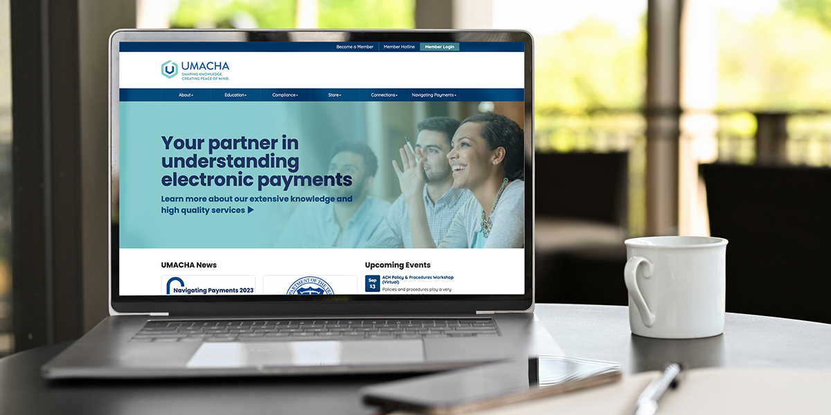
Defining essential value elevates communication with all audiences.
Project Overview
The electronic payments industry is changing at a rapid pace and UMACHA felt it was important to evolve along with it. The leadership team knew that they were more than ACH experts and they had opportunities to grow their member and client base and have broader reach with their compliance services beyond the Upper Midwest. UMACHA needed to refresh their brand to truly define what they did best, who benefited most from their services and how to bring it to light!


Client Goals
UMACHA wanted consistent communications and organized messaging. They realized they were contributing to content overload and email fatigue among their members. They wanted to create a communications and content plan for their team to manage and needed clear brand messages to use as guardrails. Ultimately they wanted to stand out in the industry to:
- Drive new membership.
- Increase current member engagement.
- Drive overall revenue.
Project Focus
The Spread Your Wings phase of the Mercury Method™ started with discovery. We gathered insights through sessions with the leadership team, survey responses from UMACHA team members, interviews with board members, association members and clients, and we layered in production meetings with the Mercury strategists, project managers, designers and brand advisors.
The UMACHA team has genuine relationships with everyone they serve. As we gathered insights from stakeholders across the organization a few key themes emerged:
- EVERY conversation used the word support and other related words to describe UMACHA – partner, resource, assistance, caring, helpful.
- EVERY person trusts UMACHA’s knowledge and expertise. They trust they will have the right answers and trust that if they don’t have an immediate answer, they will find it.
- EVERY person interviewed views UMACHA as more than ACH. Everyone views the association as “electronic payments experts” or “payments experts”.
- EVERY conversation mentioned how much they enjoy working with the UMACHA team using words like friendly, kind, good people, nice, caring, and honest; saying; “they know me”, and “they remember me”.
But, the UMACHA brand elements and communications were not reflecting their brand value and character.
"We are confident the brand guide is perfect, we love it and it’s already in use. There were so many positive comments from our member meeting! Well done and thank you to everyone at Mercury who worked on this project! Thanks also for the continued partnership and making us look so good!"
— Angi Farren, President and CEO of UMACHA
Ongoing Marketing Partnership
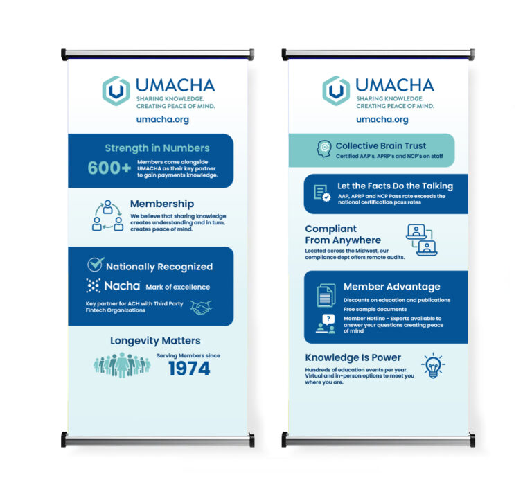
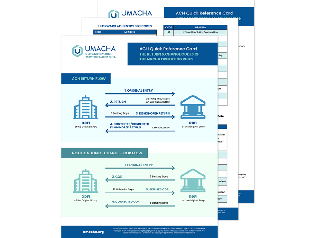
The Mercury team continues to support UMACHA with monthly marketing check-ins to help keep their brand on track and support their team with design needs for website updates, social media posts and event collateral. We are proud to be part of the UMACHA team.
Results
The Mercury Team distilled UMACHA’s essential value into just a few words: Key Partnership. We then filled their brand guide with elements that include a robust description of their ideal audience, a complete value proposition outlining their differentiator, key message pillars and content samples. Their brand guide gives them structure to build their communication plan with guardrails for clarity and alignment.
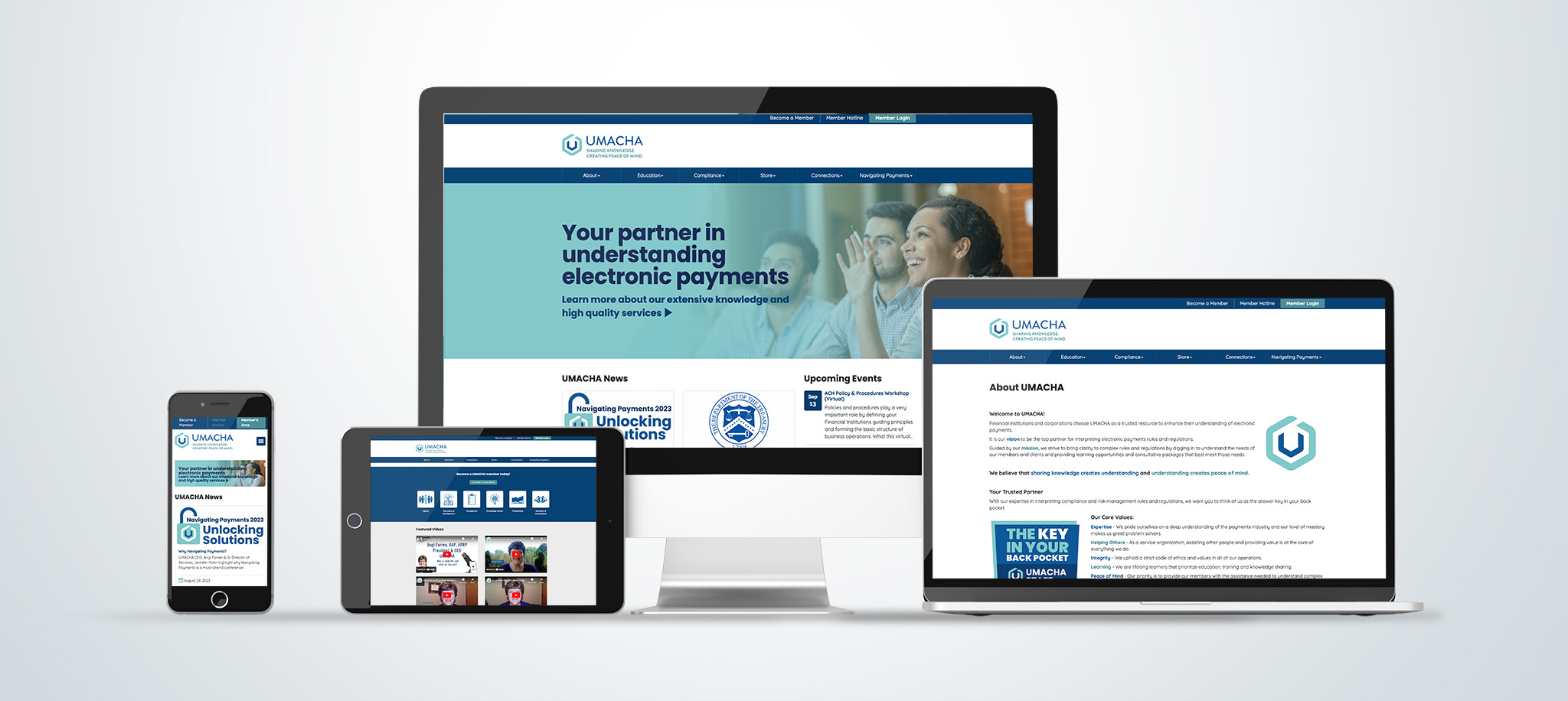
After finalizing the guide we recommended a new brand look and feel to align with their essential value. Key Partnership is the value they bring to their members through an expert yet friendly and uplifting approach.
The new logo looks like a modern letter U to some while others see the end of a key or the outline of a back pocket. The new image, tagline, fonts and colors elevate the brand and provide a perfect visual representation of UMACHA’s brand character – “the answer key in your back pocket.”