| Getting your Trinity Audio player ready... |
The third-largest city in Minnesota, Rochester, was suffering from multiple brand personalities. Although the 15 departments worked in concert to efficiently manage the large, complex City, the visual identities were inconsistent and, therefore, confusing to their organization and the community. The City of Rochester enlisted Mercury Creative Group to guide a complete rebrand of the City as an organization and create a unified look that would bring clarity, alignment, and unity to the City’s leadership and teammates.
As with every rebrand project, brand perception is a vital starting point. Insight gathering from leadership and teammates resulted in a 360° view of the organization’s brand. Multiple deep-dive strategy sessions that moved to virtual were conducted including multiple surveys to the entire organization and numerous interviews helped bring valuable impact stories and the true essential value this organization represents.
This hard (but fun!) work led to the distillation of the City’s brand platform – Forward Together. This concept plays out in the compassionate, empowered, invested and open attitudes of all of Rochester’s team members. The new brand platform speaks volumes to the uniqueness and strength this team represents.
“I’m excited about Forward Together because it reflects our “one team” commitment to those who live, work and visit Rochester, Minnesota.”
– Steve Rymer, City of Rochester City Administrator
One Logo to Lead Them All
Rochester’s situation was unique. With 15 departments, including the public library and the police and fire departments, it was essential to acknowledge and incorporate each department’s internal pride and ownership of its current visual identity. The key to a successful City identity lay in the creation of the primary overarching logo.

Driven by the brand exploration work, the resultant logo is updated and modern. The abstract R shape in the icon represents forward motion and positive momentum. It is nestled within the larger form to convey togetherness, collaboration, and inclusion. The darker middle stripe accentuates upward movement, opportunity, progress, and advancement while adding contrast and depth. The band or ribbon represents the multiple layers of individuals, our teammates, communities, and industries that together shape and create the City of Rochester.
On November 9th, the Rochester City Council unanimously approved the new brand platform and logo identity work and enthusiastically allocated additional funds to expedite the launch and support of each department’s integration of the new brand identity.
Follow the Leader
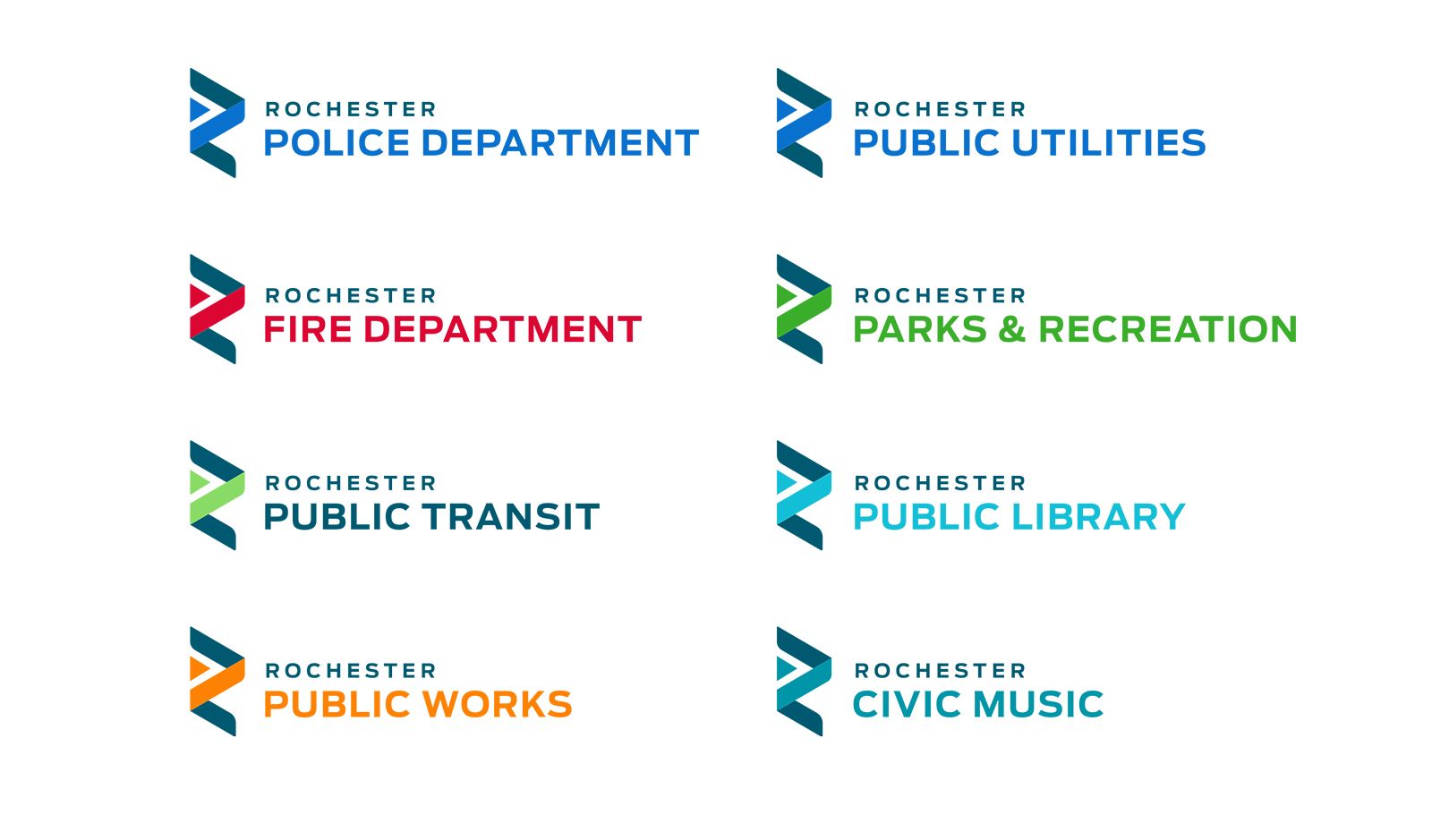
Rochester had numerous departments that felt strong ties to their current brand and the history that came with their logo and identity. Much discussion led to the ideal solutions. Each department’s visual identity now includes the main icon, the City name and their specific department name. Additionally, each department took ownership of a color that would remain unique to them. The police and fire departments have unique applications for their patch, fleet vehicles and duty wear that is seen and recognized in the community.

Ensuring that Everyone Can Talk the Talk
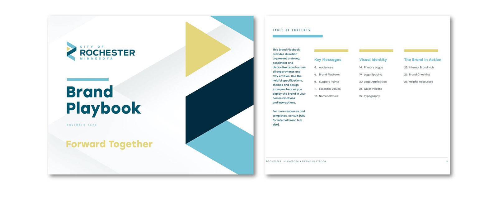
The rebranding efforts didn’t stop with the visual identity. All departments received a Brand Playbook, which allows them to quickly and easily create communications for the many audiences that the City serves. The playbook ensures brand identity and communication consistency for all departments and clarity for the community.

This is just the beginning for the City of Rochester. After the successful internal brand launch, the time has come to update the website, old logos, vehicles, apparel, and signage. Once fully incorporated, the new identity will create a buzz and excitement that supports the City’s brand platform of Forward Together.
