Rebrands
Visit Saint Paul

Award-winning rebrand attracts visitors.
Project Overview
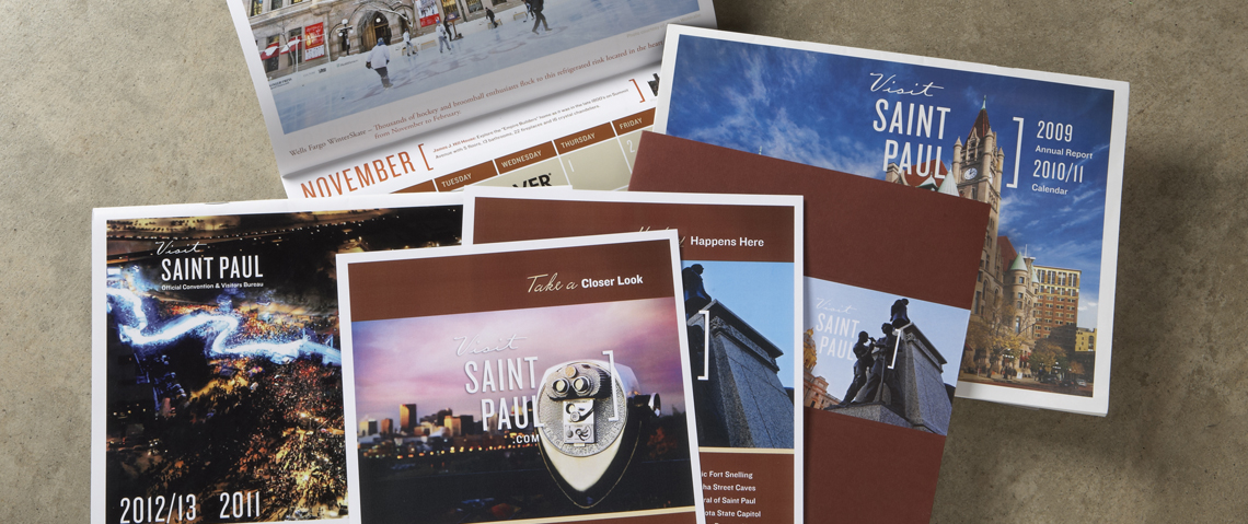
Our first rebrand planning meeting with the Visit Saint Paul team resulted in one main goal: Set Saint Paul apart from its sister city, the Mini-apple, and attract more visitors to the capital city! The approach was to show how Saint Paul is like a fine distinguished scotch while in comparison Minneapolis would be closer to a trendy martini. More splash, less substance. We also wanted to follow the trend toward shorter, more effectual names so a re-name became part of the plan.
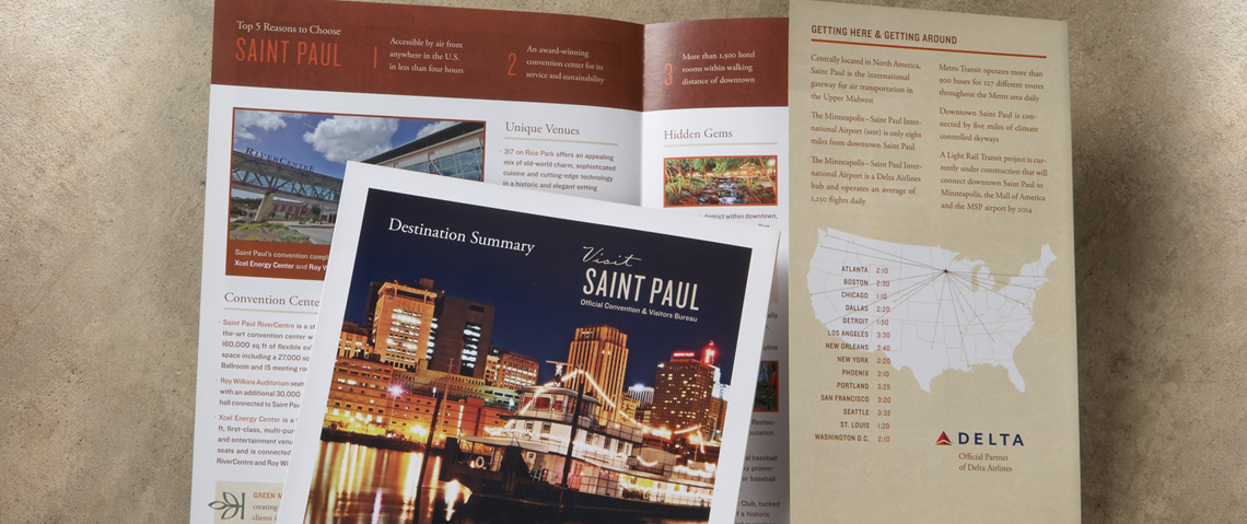
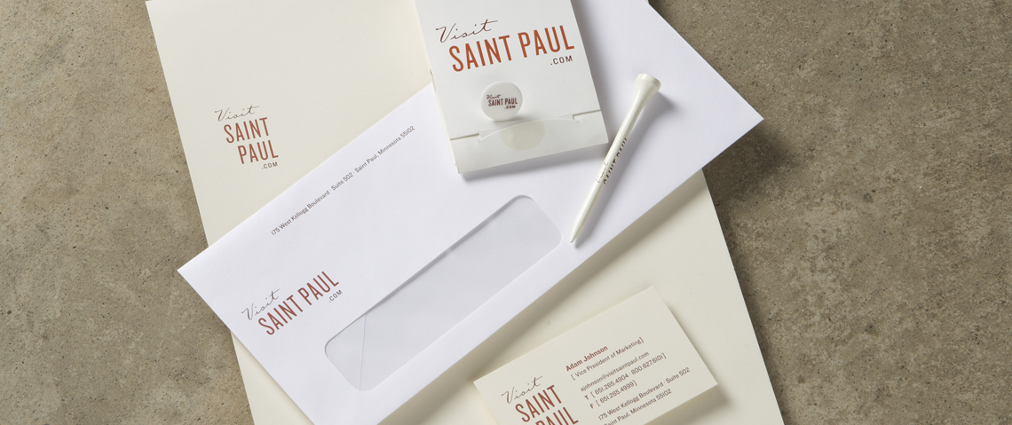
The new name, “Visit Saint Paul” was launched with a color scheme that reflects the classic, refined architecture of Saint Paul. The stacked version of the logo design puts the focus squarely on the diverse attractions, events and people that make Saint Paul unique. This design element captures reasons to visit Saint Paul in a fun, specific way that is independent of copy.
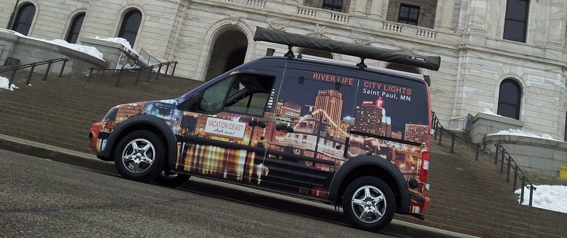
Most recently, we created Van Wrap Graphics for “Paul” the nationally known VSP Roaming Visitor Guide, which is generating a lot of buzz.
Award: MSAE Award of Excellence, Visit Saint Paul Marketing/Communications Campaign 2011


