Rebrands
UPPO

A brand that looks and acts like a leader.
Project Overview
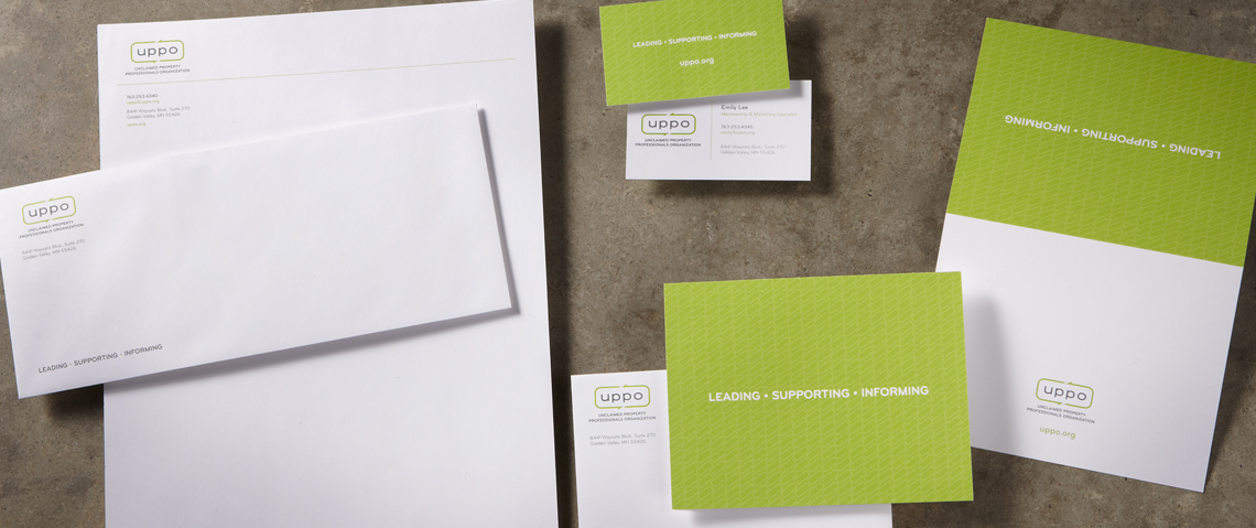
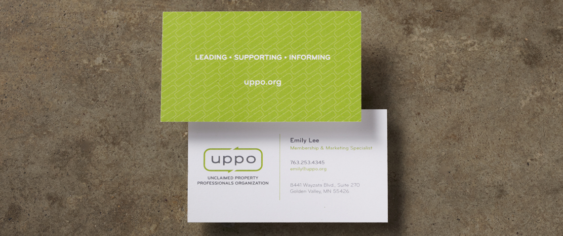
For more than 20 years, UPPO has been the undisputed resource for education, professional development, government relations and advocacy across the US and recently into Canada. While the organization continued to deliver on its mission as an industry leader; their leadership team recognized the weak connection between the brand’s value proposition and its brand identity. In other words, they were delivering all the tools, support and information craved by their members – but the brand elements themselves were outdated and uninspiring. They were talking the talk, but there was a slight limp in their walk. Mercury worked closely with them to define: their Brand Value Proposition, Brand Key Messages and Brand Talking Points. Armed with clear direction and a true grasp on what UPPO brings to the table, we began the design process. We created a new logo, tagline, identity system, and brand design usage guidelines. We also refreshed their website, which included a new look and feel.


