Rebrands, Websites
TKDA
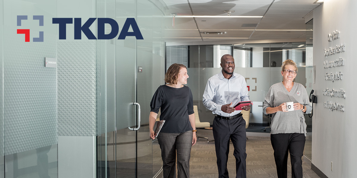
How one word established a timeless brand foundation.
Project Overview
TKDA, a national engineering, architecture, and planning firm, aimed to strengthen its brand foundation with a strategic brand refresh that clearly captured the company’s value and created alignment from the inside out. They sought more than a logo update; the TKDA leadership team wanted to create clear brand messaging, align internal culture and processes, and build a stronger market presence. The goal was to showcase their 100+ years of experience and expertise while highlighting their cutting-edge solutions and integrated team approach. With Mercury’s expertise in facilitating internal change and alignment through comprehensive brand strategy, TKDA found a trusted partner who could help solidify their brand and foster growth.
Client Goals
Drawing from more than a century of experience, TKDA wanted to position itself as an experienced and knowledgeable partner offering innovative and lasting design solutions with an integrated team approach. Challenges stemmed from the firm’s size, dispersed teams, and inconsistent messaging.
TKDA’s primary objectives for the strategic brand refresh included:
A complete brand guide that unifies all TKDA teammates:
- Align internally on essential value and brand identity.
- Promote the “integrated team” approach.
- Ensure a consistent, credible, and comprehensive brand.
- Leverage TKDA’s history to create a strong foundation for growth.
Refreshed, identifiable, and memorable brand elements:
- Elevate key messages of TKDA.
- Modernize the look and brand elements.
- Build trust through a consistent experience in voice, tone, and visual identity.
Awareness, client deepening, and growth:
- Define the ideal client and brand character.
- Highlight core values and authenticity in marketing to align with ideal clients and team members quickly.
- Educate clients on the full range of TKDA’s offerings.
"Quote."
— Name, Position
Project Focus
The Mercury brand team guided TKDA through the Mercury Method™, beginning with discovery and insights gathering to uncover brand perceptions internally and externally. The TKDA internal team referenced the multi-disciplined structure rooted in a rich history and the holistic, collaborative approach as success factors. However, when it came to how they talked about TKDA, departments were misaligned in communications and processes. Externally, current and past clients affirmed TKDA’s expertise, professionalism, trustworthiness, ease of relationship, and pointed to their “bench strength” within project teams. The Mercury team identified a positive shift in client language that elevated TKDA’s respected industry position and innovative thinking but uncovered a gap in client knowledge around TKDA’s full capabilities.
With these insights in mind, the project focused on identifying TKDA’s ideal audience and defining their brand elements. The magic happened in capturing TKDA’s brand value in one word! It was clear that the TKDA team wanted to emphasize what was confirmed through the insights gathering; their strengths are both their established experience as well as their foresight and innovative thinking. The Mercury team came to the table with the word “sagacity.” Sagacity? While it’s not a common word, the TKDA team was intrigued. It’s a word that encompassed both values they wanted to articulate, it was thought-provoking, and it invited conversation and connection.
Sagacity: The quality of being wise and able to make good decisions, an acuteness of perception and discernment. Having and showing farsightedness through experience and expertise.
That was the aha moment! “Sagacity” became the central force for the logo and visual identity updates which convey TKDA’s depth of expertise and insight to both internal stakeholders and external audiences.


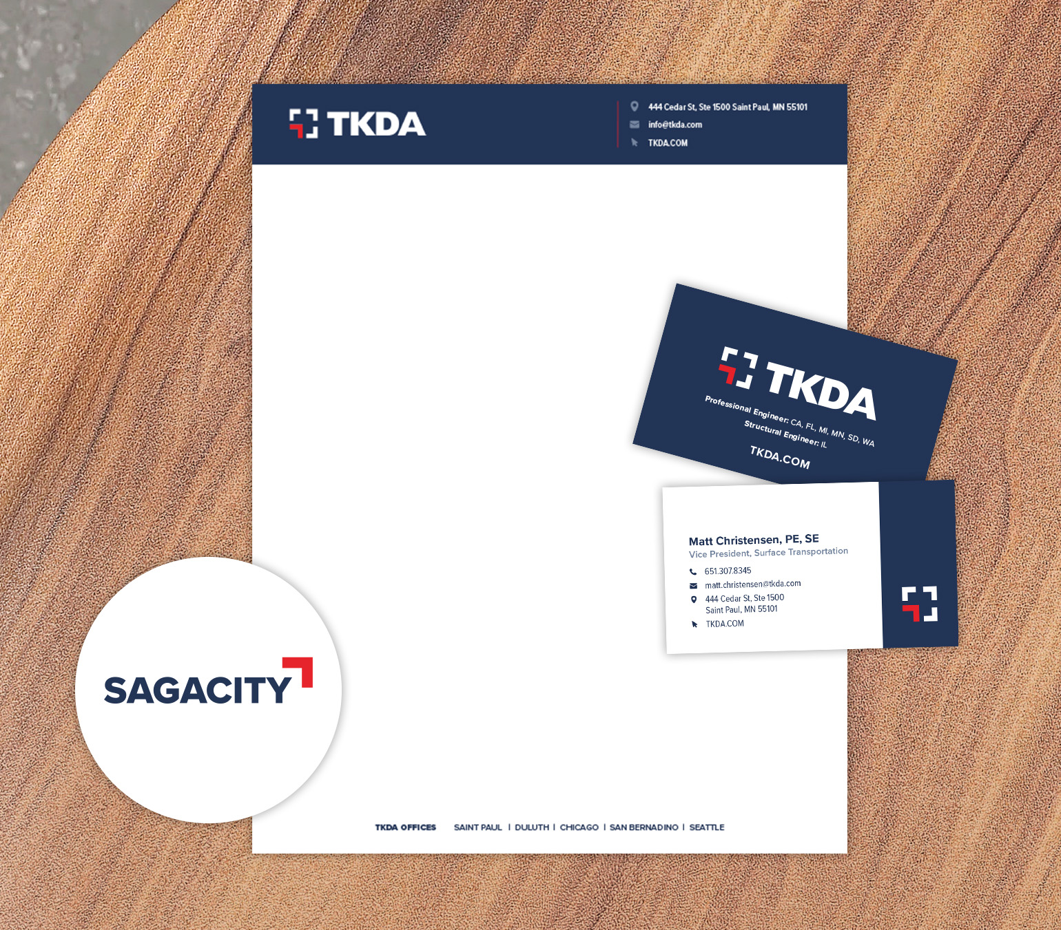
Logo and Visual Identity Updates: Mercury collaborated with TKDA to modernize its logo and visual identity, emphasizing professionalism and trustworthiness while ensuring adaptability across platforms.
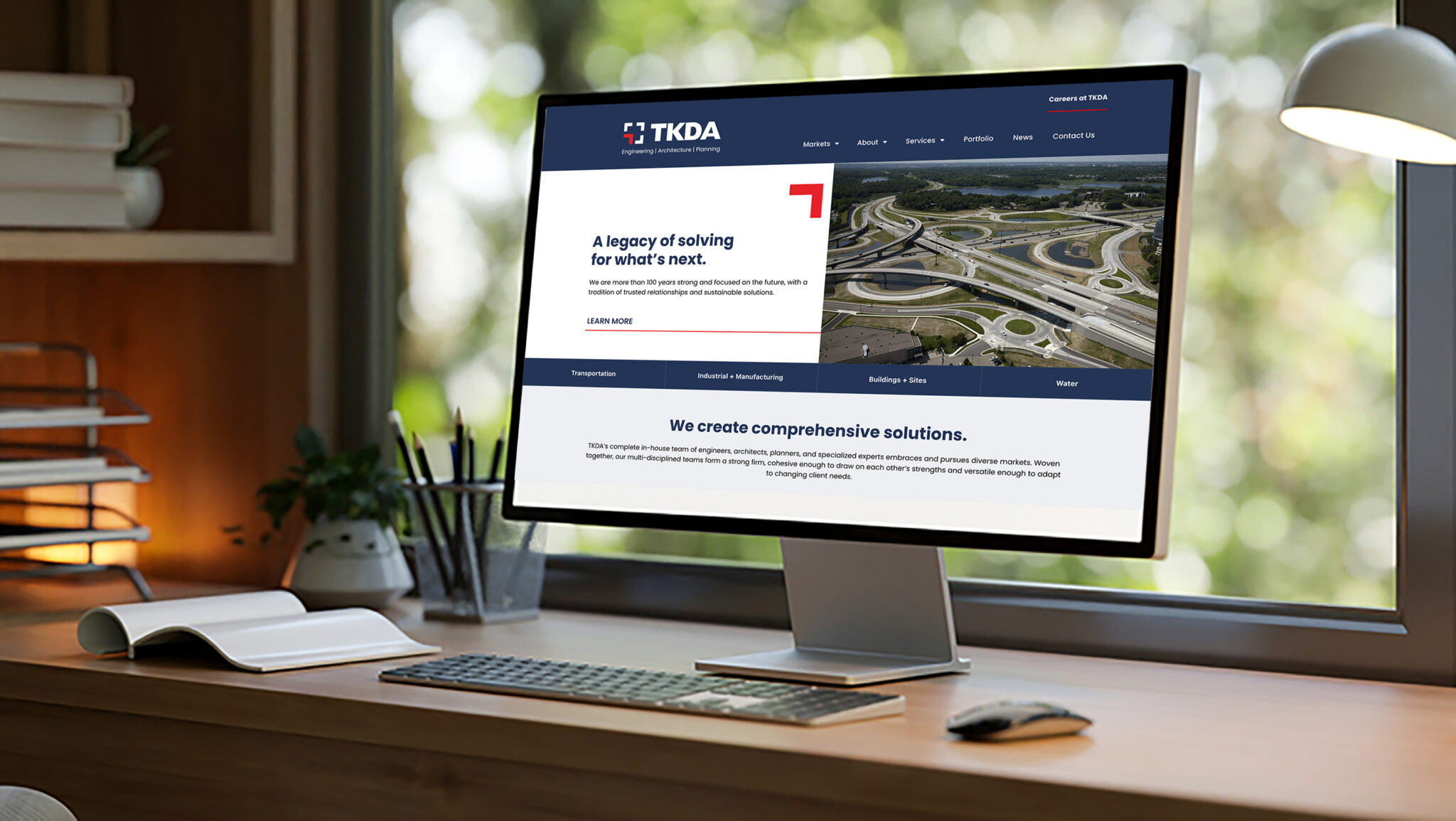
Website Redesign: The redesigned website showcased TKDA’s portfolio, services, and culture, aligning with the firm’s brand strategy, matching the internal organization structure, and enhancing user experience.
Proposal Template Standardization: Mercury defined standardized proposal templates to streamline communication materials and reinforce brand consistency across TKDA’s diverse departments.
Results
By walking through the strategic process of the Mercury Method, TKDA was able to merge their past and their future into a powerful brand story that positions the organization for growth. The success of the project resulted in achieving the goal of brand clarity around TKDA’s essential value, identifying their ideal client, and communicating the full breadth of capabilities TKDA has to offer. They were able to distill their value into one word, sagacity, that created internal cohesion, renewed energy, and stakeholder buy-in. With alignment on messaging, processes, and identity, TKDA now has a firm brand foundation that stands on over 100 years of experience and offers the foresight and wisdom that comes from that expertise. Now, that’s sagacity!

