
Rebrands
Pope Design Group

A comprehensive rebrand that helped unify messaging from the inside out.
Project Overview
Pope Architects was growing and evolving. Their leadership team had transitioned over time and there was no longer a member of the Pope family on staff. In addition, elevating design had become a deeper part of their work. Their team was expanding, and they were in the process of relocating to a new, modern location. Pope Architects needed to refresh their brand identity and messaging to align with the evolution of their business and their team.
Client Goals
Pope’s marketing team identified a need to have guardrails for their marketing – a clear set of guidelines on what words to use for the brand, in what contexts, and how to do it well. They wanted to:
- Clearly identify the company’s ideal client
- Develop a new look and feel for the brand
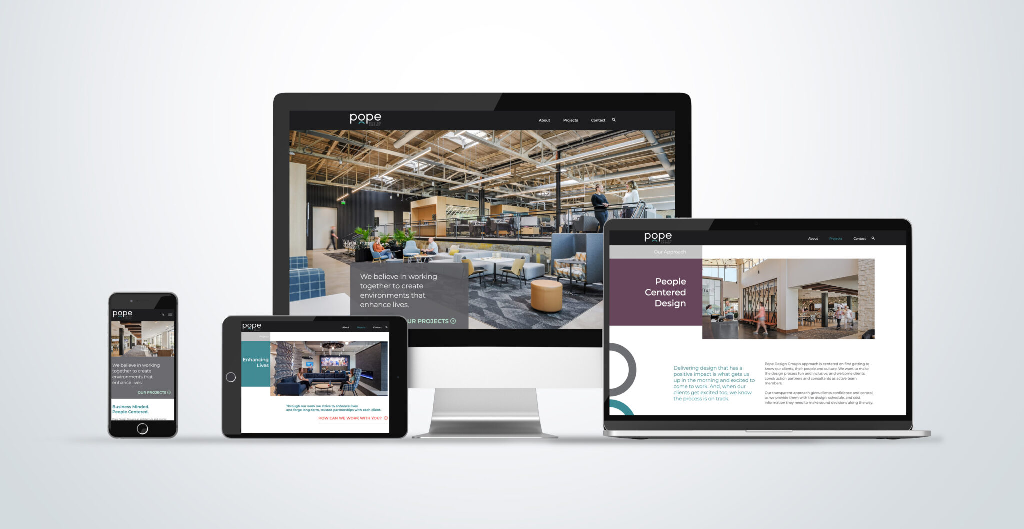
- Create consistent, modernized templates to eliminate marketing confusion
- Align the entire company with one clear brand message


Project Focus
Using our signature Mercury Method™, we gathered insights about Pope’s brand from current and past clients and team members. During the discovery process it became clear that the company name, Pope Architects, no longer aligned with who they are, what they do and who they do it for. The company’s founders set a strong foundation and wonderful legacy but there was no longer a person from the Pope family on the team. In addition, the word “architects” was only describing part of the services offered by this dynamic group.
The Mercury Team recommended that Pope Architects take part in an entity naming project. This is a big deal for leadership teams and in most cases reactions to business renaming projects are mixed. Mercury has a method for determining whether or not an organization should change their name and a proven process for research and creation. We were there to guide the leaders at Pope every step of the way.
“Not once have we regretted our decision to go with Mercury Creative Group. We’ve been happy with them, every step of the way.”
— Ward Isaacson, President and CEO of Pope Design Group
Mercury doesn’t recommend re-naming for every organization and the project doesn’t always result in a completely new name. But, we knew that the entity naming project would accomplish something big – it would align the leadership team on the best path forward! We knew that Pope Architects would
- decide to pick a brand new name,
- decide to keep their current name or,
- choose a hybrid naming option.
Ultimately, Pope Architects became Pope Design Group. Their new name honors their strong foundation AND describes how the firm has evolved to offer more than architecture services. Every member of the leadership team was able to make their voice heard throughout the naming project which served to answer questions and remove doubt. Pope Design Group is the name that sets the organization up to meet its strategic goals for the future and the team is proud to take it out into their community.
Results
“The ease of hosting client events in our new space and promoting the new brand at the same time is undeniable. Completing our rebrand and office relocation in tandem created a stronger launching point for us to lean into regarding business growth and messaging.”
– Kathy Moris, Marketing Manager
A FRESH LOOK THAT’S EASY TO UTILIZE. The rebrand and new logo gave Pope a reason to celebrate their past and future and reconnect with the broader community. Since the rebrand, Pope has found it easier to re-engage with old clients and break the ice with new clients.
BOLSTERED NATIONAL PRESENCE, INCLUDING MORE CLIENT REFERRALS. With their new booth materials and stronger identity, Pope has experienced more engagement at conferences and events and increased referrals.
A MORE ALIGNED AND DISTINGUISHABLE IDENTITY. The new name, Pope Design Group, better aligns with the organization as an EOS firm. The deviation from “architect” to “group” better supports their core values. As a result, they remain distinguishable without being a completely different entity.
ELIMINATED SILOS AND UNIFIED MARKETING. The new identity, name, and office space also helped break down barriers in the office and unify messaging among design practices. Teams experience more consistency and are more cohesive in marketing efforts.
EMPOWERED TEAM CULTURE. The rebranding process created a level of transparency that has helped employees feel involved in the changes.
AWARENESS WITH YOUNGER AUDIENCES. Pope had a very successful summer internship program since the rebrand launch. The new website and social presence around the rebrand helped to create awareness and engage young professionals in their industry.