
Rebrands, Logos
New Market Bank

Family-owned community bank seeks brand clarity and identity refresh to carry it into the future.
Project Overview
Founded in 1905, New Market Bank is a fourth-generation, family-owned community bank with three locations in the Twin Cities south metro. It has endured more than 100 years through the strength of its relationships with its customers and the communities in which it operates. While a fraction of the size of the Wall Street banks, New Market Bank has kept pace on the expansion into digital capabilities, products and services while remaining committed to relationship banking.
Even though the bank has evolved in recent years, its brand identity had grown stale and dated in appearance. New Market Bank sought help from Mercury Creative Group to develop a new brand identity that honored the bank’s past while carrying into the future.
Client Goals
- Bring clarity around the bank’s brand and target audiences
- Provide the 115-year-old, family-owned bank a professional visual identity that honors the past and embraces the future
- Connect the visual identity to the bank’s vision and community-focused operating philosophy


Project Focus
Discovering What Matters
Mercury led the New Market Bank marketing team through a series of discovery sessions to help bring clarity around the bank’s brand, target audiences, and marketing objectives. Those sessions helped the Mercury team understand the rich history of the bank and its business priorities, as well as its commitment to the tagline stemming from its corporate vision statement: “Community banking as easy and sincere as a handshake since 1905.”
Concepts Conveying Community, Relationships, Longevity
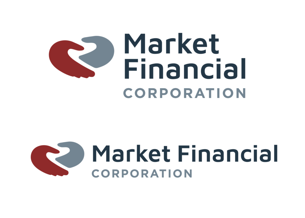
Based on the information gathered in the Discovery phase, Mercury’s brand experts developed several initial logo concepts that conveyed community, relationships, and longevity. The bank’s marketing team selected a few finalists to be refined and colorized. After some tweaking, the chosen logo was one featuring a modern wordmark, crisp color palette, and an icon that resembles two hands shaking. An alternate version referencing 1905 more directly calls out the longevity of the institution. Mercury also delivered a version of the logo for the bank’s financial services affiliate as well as logo design guidelines to help the bank’s marketers and vendors implement the new identity across all uses.
Coordinated Unveiling
After months of planning and preparation, New Market Bank rolled out its new visual identity on June 10, 2021, the 116th anniversary of its founding. The marketing team coordinated a series of unveiling events with the chambers of commerce in each of its three markets and timed simultaneous customer communications, a release to news media and social media posts to create a splash. The new identity was warmly received by industry peers, personal and business customers, and the community.

