Rebrands
Minnesota Museum of American Art

New name keeps it short + sweet.
Project Overview
Mercury Creative Group guided the Minnesota Museum of American Art (MMAA) leadership team through a series of in-depth brand strategy sessions – using its proprietary Mercury Method branding exercise – that evaluated where the organization had been and where it wants to go. The process found one word to describe how its various audiences perceive the museum: inspiring. The discovery of this essential value reconnected leadership to its own brand, prompted a name change and informed the design of a fresh and memorable brand identity.

Seminal Arts Organization Continues to Evolve
Founded in the 1880s, St. Paul-based MMAA is one of the oldest arts organizations in Minnesota. With several name changes, location changes and evolution of its collection during more than a century of operation, MMAA aspired once again to take its place as a leader in the arts community.
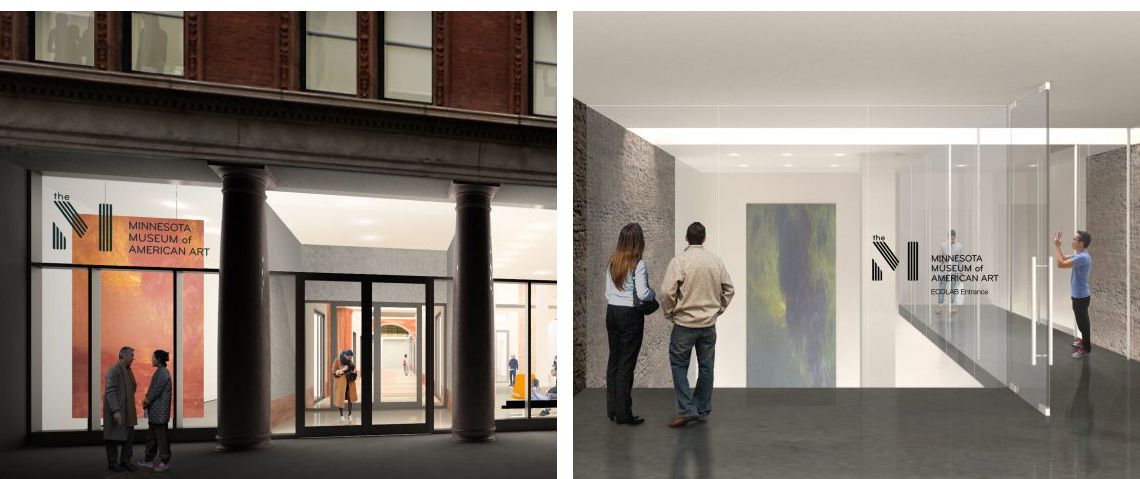
An exciting and integral piece of the organization’s growth is a permanent home for the museum inside the historic Pioneer Endicott building in the heart of downtown St. Paul. This $12.5 million development project includes major renovations to the building, originally designed by Cass Gilbert and Solon Beman, that provide more than 20,000 square feet of public space. The much-anticipated opening of the new space already has been honored as one of Architectural Digest’s “15 Most Noteworthy Museums Opening This Year.”


Challenge
The long name, The Minnesota Museum of American Art, often shortened to MMAA – or to some erroneous iteration – made for a foggy brand identity.
The brand strategy sessions and the communications audit Mercury performed helped leadership decide the time was right to abandon “MMAA” and develop a fresh and user-friendly name that would help solidify its brand recognition and help the museum connect with a whole new audience.
Solution
After a deep dive into understanding what makes the museum inspirational, the M was born. As the most important letter in the former abbreviation, the M stands for both Museum and Minnesota, the essential elements of the organization for more than 100 years.
The new moniker and brand identity are as fresh, exciting and approachable as the museum itself. Not only are the name and graphics efficient, they’re inspiring. Named the “Twin Cities Best Museum” by City Pages, the M is nicely positioned to continue offering thought-provoking, inspiring shows that celebrate talented local and national artists.
