Rebrands
City of Rochester Minnesota
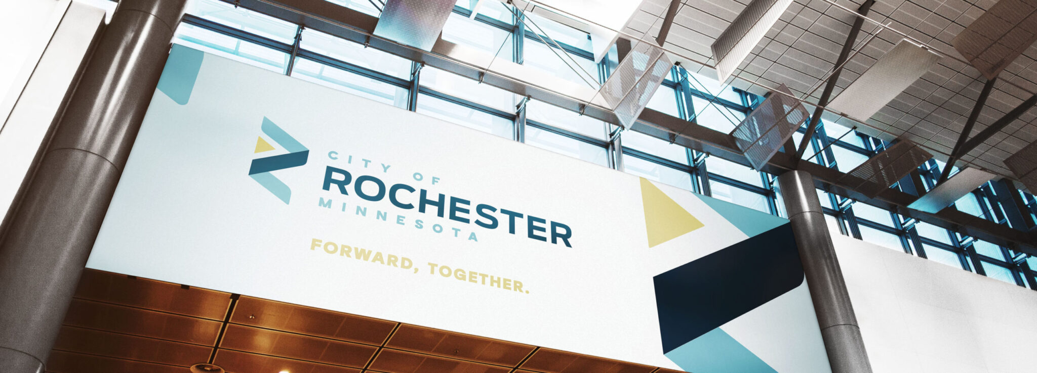
Clarity and unity are key, especially when you have 900+ employees and 15 diverse departments.
Project Overview
As Minnesota’s third largest city, Rochester has plenty to offer those who live, work and visit. What it lacked was a common brand platform to unite its more than 900 city teammates and 15 diverse departments as a single organization. After an extensive agency search and RFP process, city officials chose Mercury Creative Group. Combining the Mercury Method™ and our deep experience with other municipalities made us an ideal candidate to lead this multi-faceted and high visibility project. The resulting brand work delivered:
- Compelling new messaging
- A modern yet approachable visual design and logo system
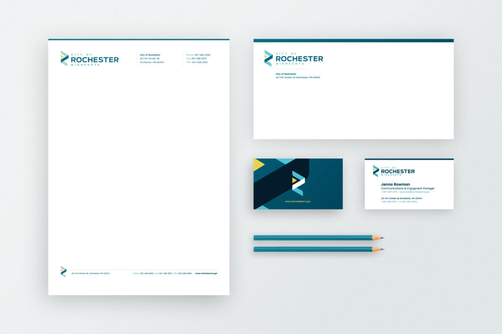
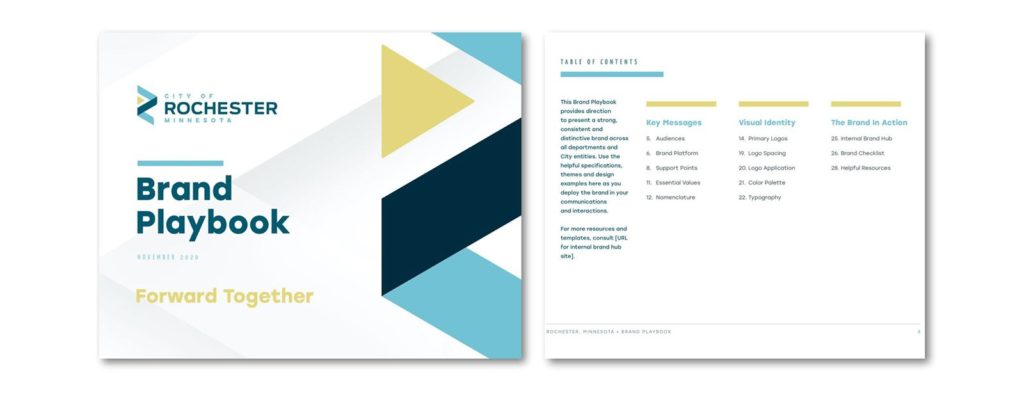
- Tools and templates for internal and external communications
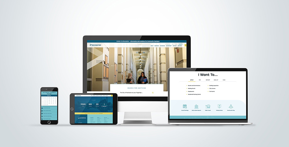
- A streamlined City of Rochester website for residents and visitors
The new brand represents Rochester consistently, no matter where audiences encounter it. It unites staff around a common vision, and amplifies the city’s voice in the community, helping teammates deliver a powerful experience that builds credibility, trust and pride.
Client Goals
- Create a modern and inclusive brand platform
- Develop a common visual identity across all 15 city departments
- Align all 900+ city employees around a common purpose and message
- Produce branded documents and templates for internal and external communications
- Update and streamline the City of Rochester website for residents and visitors
Project Focus
The Mercury team embraced our role with enthusiasm, employing proven brand-building techniques to identify the core values and unique elements of the city’s DNA. We worked across all levels and departments, including senior managers and front-line staff, and functions from police, fire and public works to parks, library and utilities. More importantly, our weekly virtual sessions emphasized open communication, cross-functional collaboration and inclusivity. Building consensus and employee support for the new brand was critical to success. The resulting brand platform, “Forward Together,” represents the city’s shared spirit of teamwork, progress and inclusion. It encompasses the positive momentum, opportunity and engagement that city workers make possible for residents and visitors. It also showcases how coming together as a cohesive team makes the city more powerful than the sum of individual parts, employees or departments. The new logo system translates Rochester’s essential values into a flexible and timeless visual identity that spans all city entities. New fonts, brand guidelines and communication templates equip both designers and frontline employees with the tools needed to use the brand in day-to-day operations. The work was a hit with staff—and received unanimous approval by the Rochester City Council.
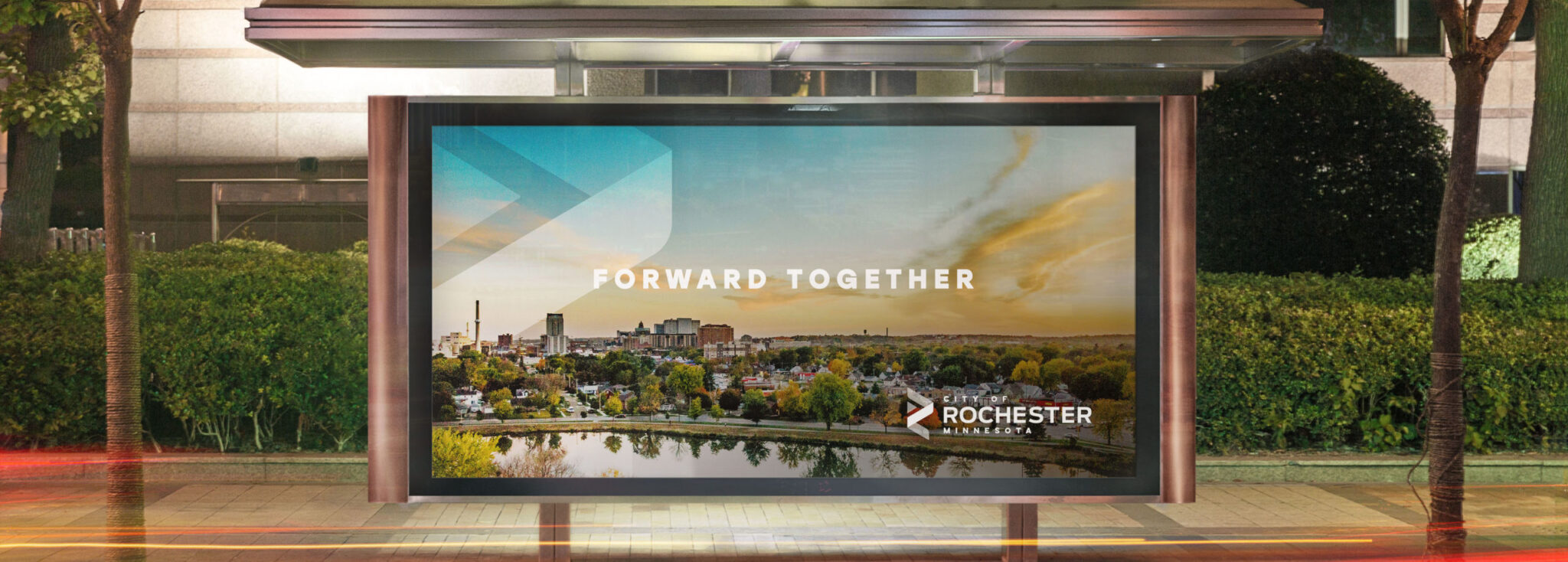
Moving Forward Together with the City of Rochester
Our work extended far beyond initial materials. We collaborated closely with the city’s communications team to coordinate a fun and educational brand launch. With a series of videos, a brand intranet site, launch day activities and all-volunteer “Brand Champions” embedded in each department, we helped create momentum and sustainability.
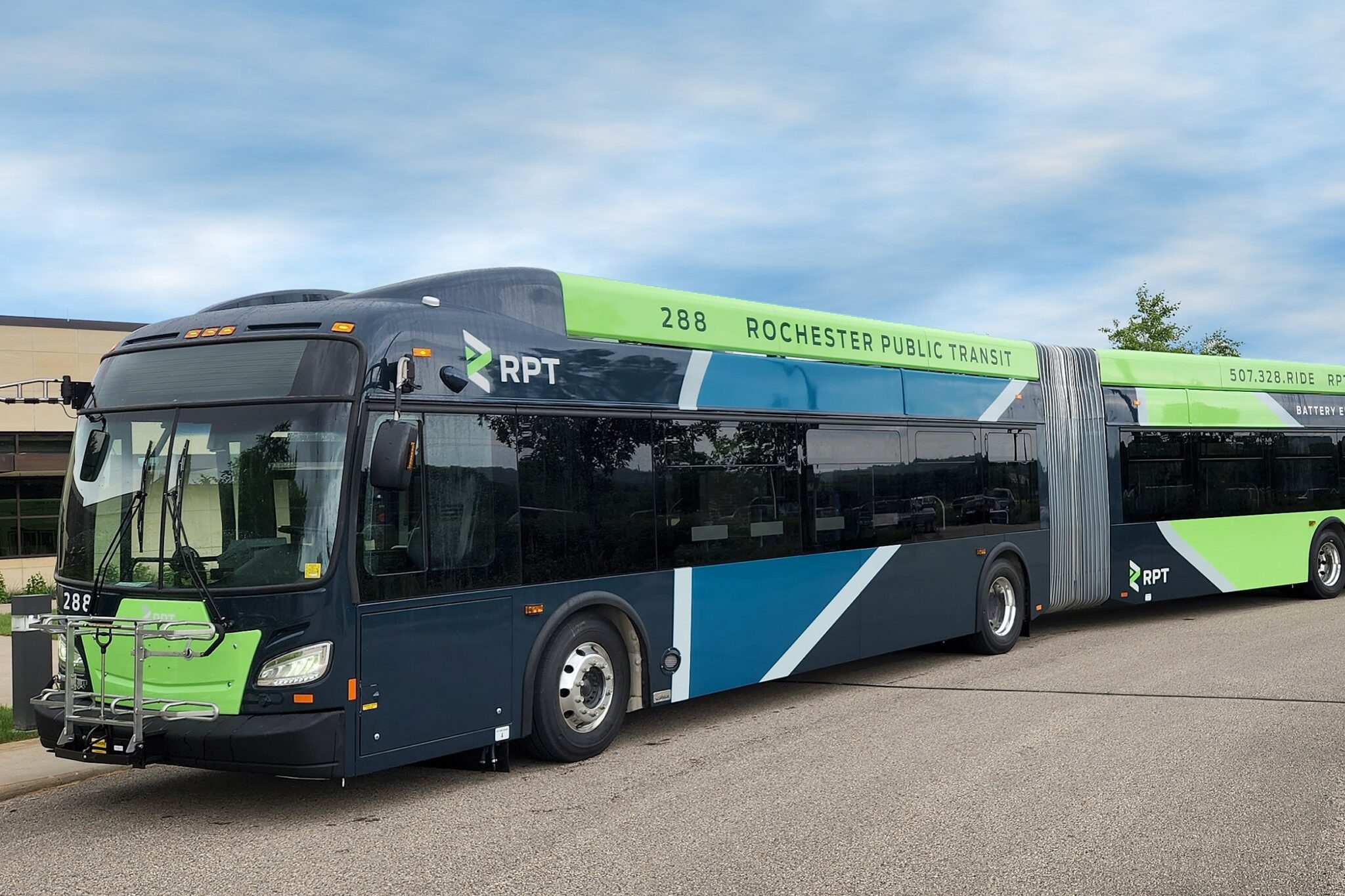
City staff continue to tap into our resources for brand-related projects, from redesigning and simplifying the City of Rochester website, to updating vehicle graphics and departmental websites. It’s a lasting partnership we’re proud to be part of.
35
city teammates participating
355
individuals providing input to brand surveys
15
city departments represented
