Rebrands
Associations North
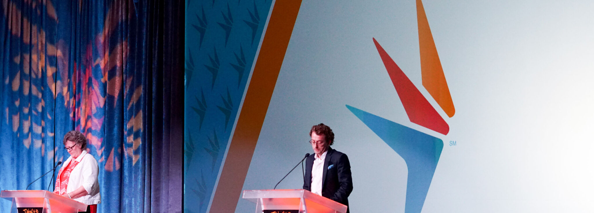
Connecting an industry leader to its members.
Project Overview
For nearly 60 years, The Midwest Society of Association Executives had led the charge in the advancement of association professionals. As the organization approached its milestone 60th year, they hit the pause button and explored the possibility of a brand refresh. Over the years, MSAE’s audience changed from primarily association executives to include all association professionals. With that in mind, it was concluded that MSAE would undergo a complete rebrand, including a renaming of the organization.
Client Goals
- Identify with a name that more succinctly captures who we are and what we do.
- Achieve a branding solution that positions us for the future by bringing a new energy and relevance to our brand.
Project Focus
MSAE created a rebrand task force to engage in the process. The task force consisted of three board members, three staff members, three general members and two branding experts from our team. Having the right mix of people committed to the process played a key role in the success of this rebrand.
During many in-depth working sessions, the task force uncovered Advancement as MSAE’s primary purpose. An internal document was then created to support MSAE’s abilities to contribute to the advancement of both association industry professionals, and the association industry as a whole. This document become our “guiding light” as we crafted the new name and identity. After exploring many options for the name, Associations North was chosen.
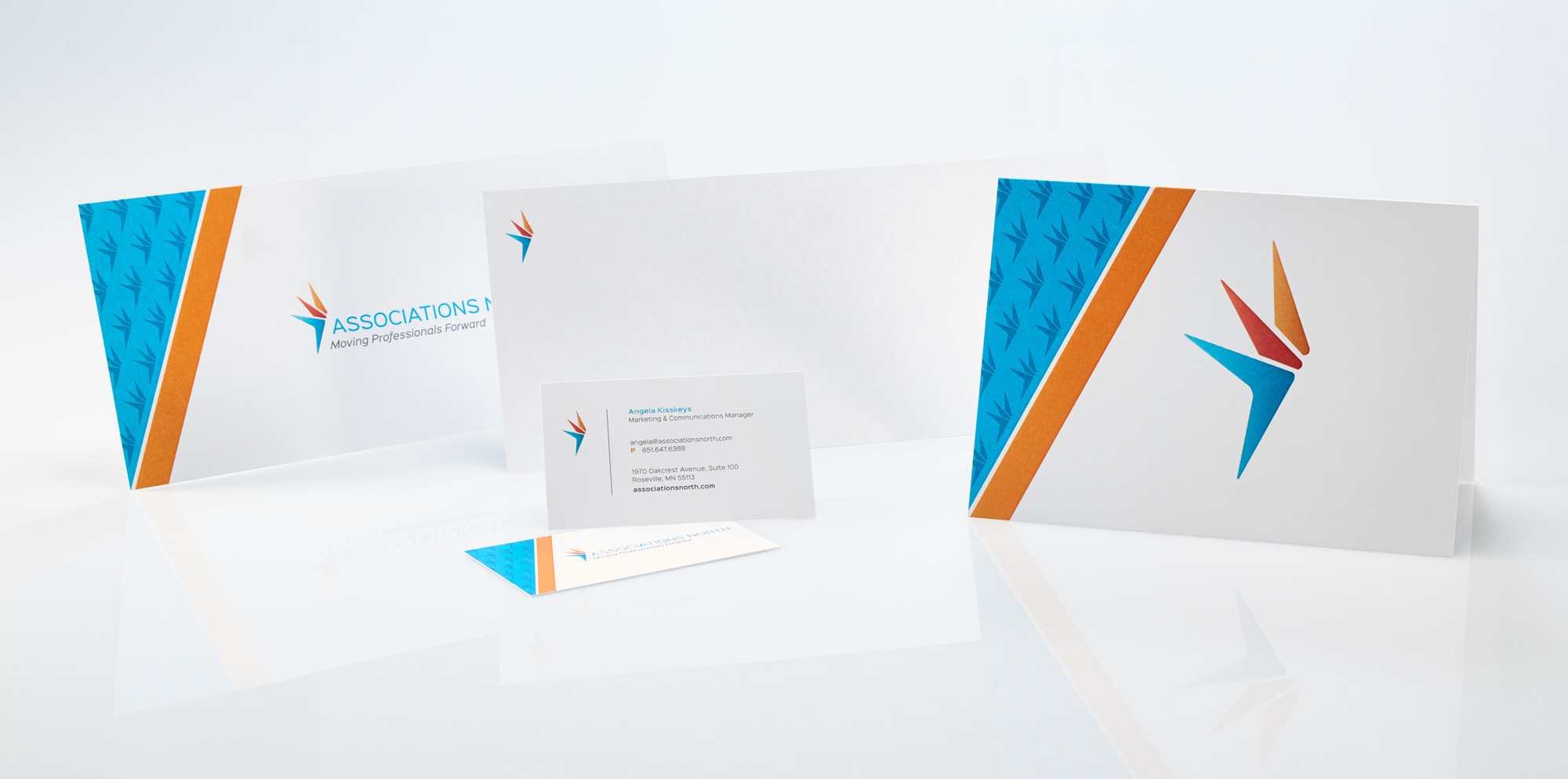
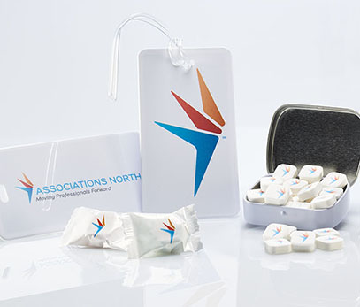
The new name is simple, meaningful, fits their audience and adds a measure of aspiration. It’s about leadership, authenticity and principles. It’s not the destination, rather the journey forward. The logo expresses forward motion and advancement in a clear and compelling manner. The colors and typeface selections are modern and clean and alludes to the spark of fun that Associations North brings to all they do.
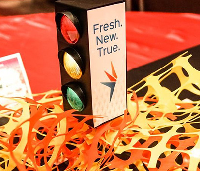
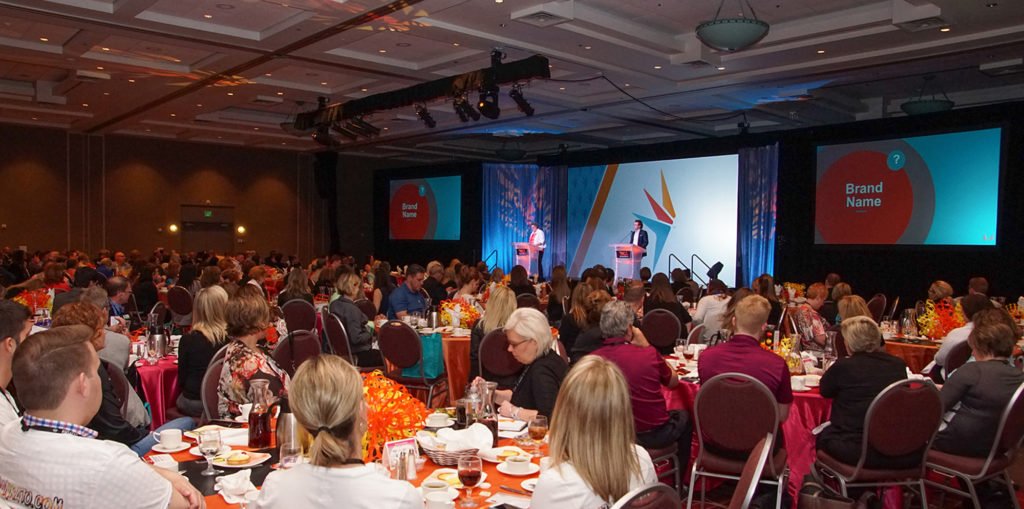
Their new tagline, Moving Professionals Forward, helps further explain the overall essential value and brand story. In addition to the development of the new brand identity, we helped Associations North plan and orchestrate the launch of their new brand at their highly attended Annual Meeting & Expo. To ramp up the excitement, a teaser tagline was developed: Fresh, New & True. The event lived up to that tagline and more.
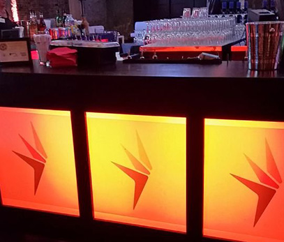
Touches of the new brand were peppered throughout the event and the response from the membership was overwhelmingly positive.