Marketing
Associations North
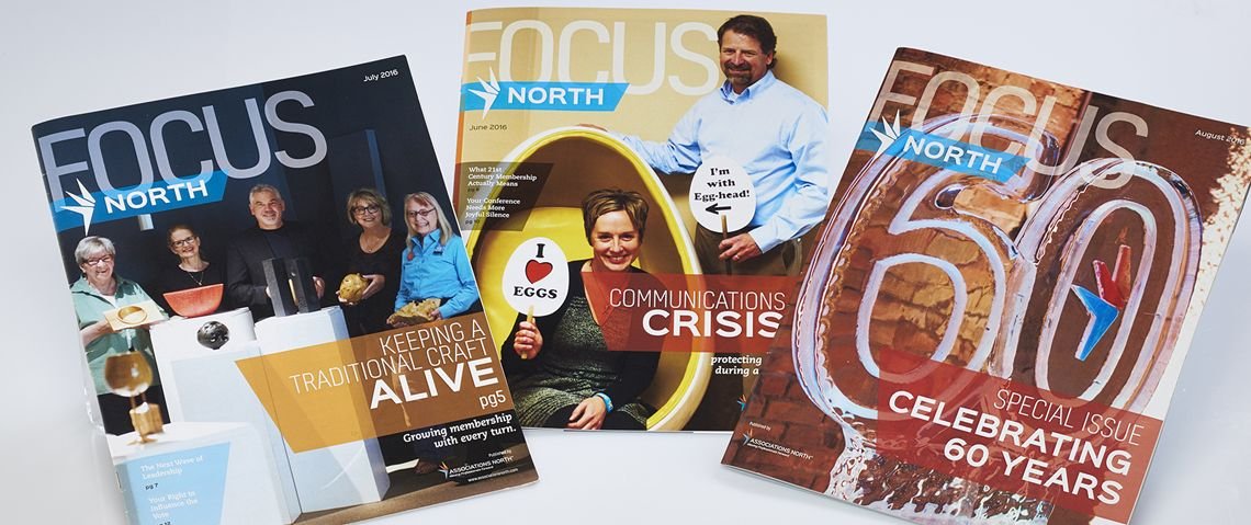
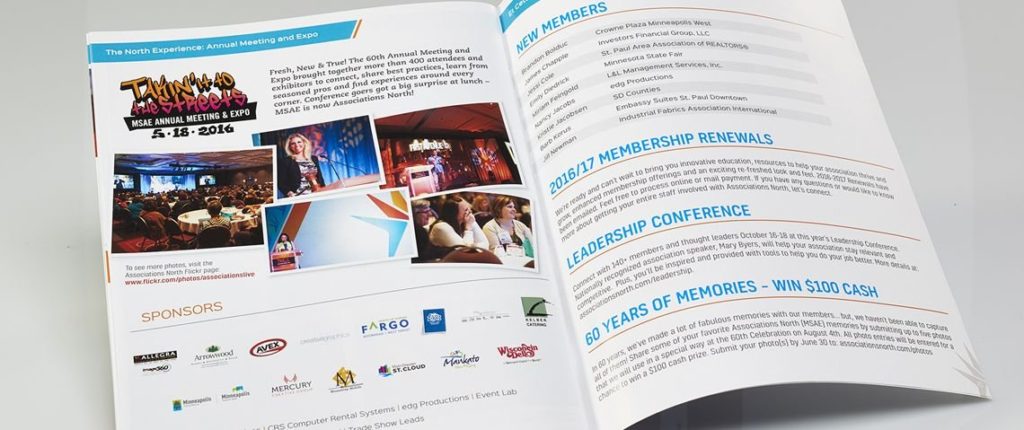
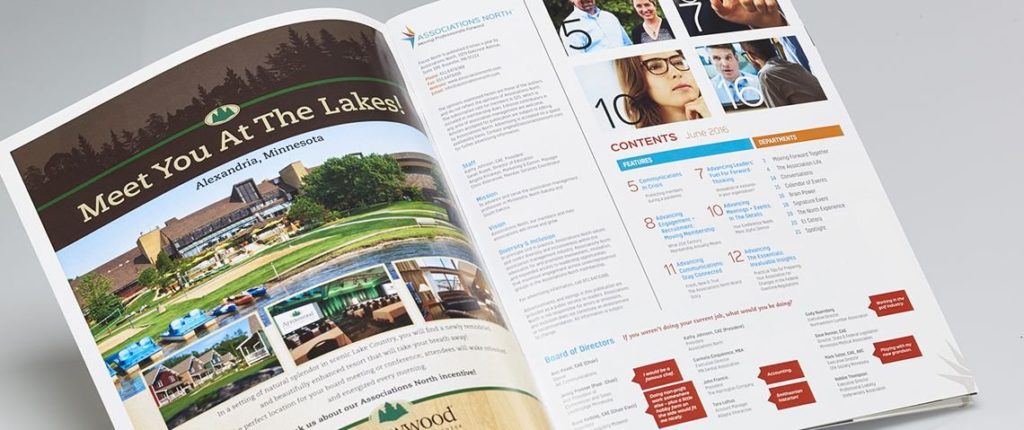
Fresh magazine design puts the focus where it should be - on the members.
Project Overview
As part of the major rebrand of their 60 year old association, Associations North engaged us to reinvent their in-house magazine. Having walked through all stages of their rebrand together, we all knew that they magazine should be centered around the association’s essential value – advancement. Keeping the advancement of members and their associations in mind, we created a fresh design and compelling layout. Every edition has original content in keys areas that contribute to the personal and professional growth of all members. Each of the nine annual issues will feature one of the following: an association, a member and a sponsor. The reworked, full-color magazine, FOCUS North, debuted to great reviews. The articles and features are producing more buzz than ever. The nearly 10% increase in requests for printed versus digital copies of the magazine serves as evidence that print (done right) is absolutely not dead!
